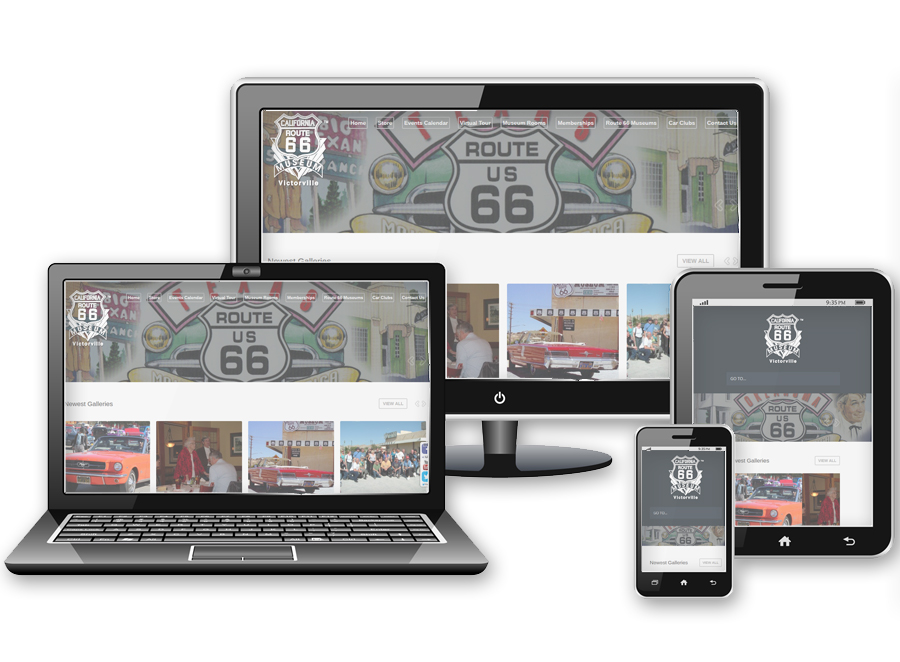
It’s official! 3dCart has announced full support for responsive e-commerce store design. The “desktop version” and “mobile commerce version” will soon be a thing of the past. What is “responsive” design, you ask? It’s when one website fits desktops, tablets and mobile phone browser formats. Responsive design has special, device-specific coding to make it easier for touch-based interactivity. It also has design that can adjust and resize to fit the devices.
Though 3dCart will be making responsive layouts available in their free and premium templates collections, it will take some level of HTML knowledge to customize the design to fit your needs and match your unique visual branding. That’s where we come in. We can design new and unique responsive 3dCart e-commerce store design for you from scratch and code all 55-plus page layouts in your store template folder. We can also retrofit your current store! That’s right… when you install a new 3dCart responsive design layout, it will not automatically make all of your website content fit the new responsive format. That has to be done manually. You will need to reformat all of your current 3dCart HTML including website content and product listings, and all of the custom HTML pages that your layout is using will need to be updated to the new HTML 5 code standard to make use of all of 3dCart’s new dynamic responsive coding.
If you have questions – please feel free to call us at 702-781-8004 or send us an email, we’d be glad to help you.


